Commercial Office Design Trends Offer Corporate Flexibility
 The Orange County Business Journal came out with an article this week about office design trends in interior, commercial spaces. Our very own Rick D’Amato was tapped for the piece, fitting as he’s designed spaces for some of the most prestigious companies in the country— Ford Motor Company, Toyota, The Yard House Restaurants, Urban Decay Cosmetics, ASICS America, Blizzard Entertainment, Pacific Dental Services, Mossimo, The La Jolla Group and Volcom, to name a few. He made some interesting points in the article and we thought it’d be fun to revisit three of them, and give ideas you can implement in your own office workspace.
Rick D’Amato, AIA, LEED AP BD+C
1. “With the recession, there has been this goal to consolidate and reduce square footage,” said Rick D’Amato, principal senior designer for design firm, LPA Inc. “It has really created this need to dial-in and understand the work process, and it’s really enabling us to think more about that process with our clients. We have to really understand how they work and how we can help them work smarter.”
Open, more collaborative office environments require less space. Workstations like the ones pictured, from LPA’s office in Irvine, give employees enough space to work efficiently with ample room for storage, and the ability to customize desk height or add additional lighting. Did we mention that everyone from the CEO on down, sits in stations like these? By eliminating private offices and using shared meeting spaces, also pictured, space is used wisely. Plus, everyone gets to enjoy the windows—as there isn’t a string of private offices using them up. There’s also a more approachable, team-oriented feel in office setups such as these.
2. “The home and office are becoming a lot more synonymous,” D’Amato said. “Companies want to make their staff as comfortable as possible.”
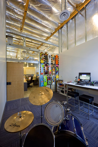
At the Surfrider Foundation headquarters, designed by D'Amato for the non-profit in San Clemente, Calif., you'll find an organization of people who have made themselves at home.  One employee brought a drum set into his space, personalizing it, and blurring the lines between work and play. Other employees bring their dogs to work while surf art and bumper stickers are displayed thoughtfully, throughout.
The Surfrider space is sustainably designed, and has achieved LEED Gold certification from the U.S. Green Building Council.
Noteworthy green interior design features include:
- Energy-efficient, automated lighting fixtures
- Natural daylight and task lighting
- Recycled materials in carpet, furniture and hardware
- Water-efficient fixtures throughout
- Natural ventilation and use of low-emitting materials for optimum air quality
- Reuse of furniture, doors, frames, and hardware from the previous office
- Metal partitions, legs, wire managers and storage pedestals are manufactured from steel containing recycled material
- All manufacturing was done within 50 miles of the job site, reducing fuel consumption in transportation
Many of the design elements were either bought at local home improvement stores (i.e. IKEA) or constructed onsite with off-the-shelf materials, proving that it doesn’t cost a lot to create a workspace that’s functional, open, bright, and consistent with your brand.
3. “We’re designing spaces around technology, rather than finding ways for technology to fit into a space … that’s really changing the whole complexion of how we’re looking at design,” D’Amato said. “Thinking about the future of technology, how we keep our workspaces as flexible as possible.”
As mentioned in the O.C. Business Journal article, D’Amato designed a conference room for LPA that is designed around the use of a special piece of furniture, called media:scape— a desking system designed to increase productivity and innovation through a “walk-up and connect” experience. The scape has HD videoconferencing with lounge seating that enables people to gather around, and meet comfortably.
There are endless ways technology and workflows can be better accommodated in classic corporate workspaces. We hope this post has given you some applicable ideas, and we look forward to sharing more about commercial office interior design in future posts.
Rick D’Amato is a Senior Designer and Principal at California-based LPA Inc. For more than 20 years D’Amato’s designed award winning spaces for corporate office facilities, retail projects, schools, city halls, libraries and community centers. He is an active member of the American Institute of Architects, the U.S. Green Building Council, the California Library Association, American Public Library Association and Public Library Association.
HELPFUL LINKS
http://www.ccim.com/cire-magazine/articles/10-trends-office-design
http://blog.lpainc.com/lpa-blog/bid/87876/Commercial-Office-Design-Trends-Corporate-Flexibility
http://mindfuldesignconsulting.com/commercial-interior-design-trends-for-2012/