Service Spotlight: Signage and Graphics with Rick D’Amato
 As part of a continuing series on this blog, we’ll take a look at members from each of our services to highlight LPA’s integrated design process and showcase our commitment to sustainable design.
This month, we sat down with Rick D'Amato, to discuss the impact of signage and graphics in the overall design function and why integrated design is better for the design team, the client and the project:
Q: How long have you worked at LPA?
A: I started at LPA a little more than 29 years ago. I worked in architecture and interiors in several market segments. About 15 years ago I started working with our graphics and signage program. I do have a really strong background in graphics and signage having run my own graphics company in college and after college for several years.
Q: Why do you think it is valuable to work at an integrated design firm?
A: I see graphics and signage as having the ability to be something much more integrated into architecture and interiors and an integral piece of a design statement. It’s not just something that after the fact we take a look at the project or the interiors and we say, “Okay, it [the project] needs a sign here, it needs a sign here.” What we do is really think about these things holistically from the very beginning of the project. There’s just something about the ability to move across these sorts of disciplines and be able to gather everybody together from day one. I think it just makes for a stronger project and it makes for a stronger design. And I think it just makes for an overall stronger narrative from the beginning to the end of a project. The more you can have that holistic involvement of all the different disciplines and having that all in-house, I think just makes us stronger designers.
Q: What does a day in the life of Rick D’Amato look like?
A: Lately we are in the process of trying to come together as a group with regard to interior design, especially with our Urban Design Studio. It’s been my goal to bring these people together, to share resources, to share ideas and to become a stronger interior design firm overall. I think we have the ability to be the strongest interior design firm in the state, if not the nation, if we could just apply ourselves and start using our knowledge and really combining our resources. That’s my daily goal is to right now steer the traffic and get everybody talking and get everybody working together. It’s just about understanding the importance of design, the importance about meaning in design, providing meaning in design and really spreading that message to the whole interior design staff.
Q: How does wayfinding with signage/graphics impact the overall design function of a space?
A: I think it’s definitely an enhancement to design. In a lot of our projects we see the signage and graphics and wayfinding programs being thought about hand-in-hand with the design of the space and really integrating that into the architecture itself. It’s about how you use light and color and it’s about how you use form to really start to bring people through a space and how that’s then enhanced by the actual narratives and signage that you apply. It’s about understanding the sort of process of moving through a building, into a building, around a building and how the building itself can start to enhance that experience.
 Q: What’s the most interesting project you’ve worked on? What did it entail?
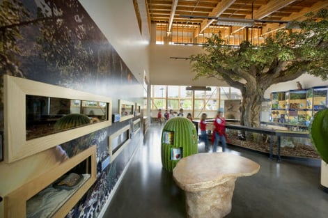
A: I think one of the most interesting had to be the Environmental Nature Center (ENC). I was just really pleased with the whole way that program came about. It was derived very early on in the design of the space and it was really integral to not only the form and the design of the space but the materiality and sustainability of the space. It became a great way to talk about the design not only just about how you get from Point A to Point B but it was why you wanted to go from Point A to Point B. And it was about the whole sustainable aspect of getting from Point A to Point B. That holistic approach to signage and graphics I think really comes across at the ENC.
Another one would be the almost completed parking structure in West Hollywood just because we had the opportunity there to work very early on with a very famous international public artist named Ned Kahn. And we actually brought a graphics component into the design of the space. He worked very closely with us from day one which allowed us to create the architecture around this public art component and it became really integral to the way the building was designed. It becomes an animated component of the building and it’s about using art, graphics and signage to start to understand the way a building can affect public perception.
Q: What advice would you give someone thinking about becoming an interior designer?
Understand the details. It’s funny because having worked in both architecture and interiors, there’s something so much more intimate about interior design. It’s so much more tactile. It’s so much more visual. You can experience architecture from 10, 20, 30, 50 feet away. But with interiors you are right there. You’re understanding everything there is about that space from being enveloped by it. I think it takes a whole different approach, a whole different eye.
