It's All in the Details: Corporate Interior Design Round-Up
Thu, Jul 23, 2015 Karen Thomas Karen Thomas, Office Design, Office Interiors, Interior Design, Corporate Facilities
 Flexible spaces, strong graphics and signage and strategically selected products all work together to make your corporate space your own and a reflection of your company. Here's a round-up of interior design trends in action:
MerchSource
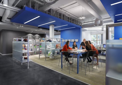
MerchSource—a company that ideates, designs, sources and distributes consumer products to the nation’s largest retailers—asked LPA to design their California headquarters. The design team took an existing 27,000-square-foot building—originally designed by LPA for a residential developer—and created a flexible, energetic environment that showcases the firm’s product lines and creative design process. Showrooms and design studios are enhanced by reclaimed wood flooring, crisp white walls and attention to lighting detail. Bold accent colors and signage and graphics were strategically selected to allow the products and merchandise to be highlighted and easily rearranged. A fitness room and café for employees and guests were an added amenity, and bicycle storage, energy-efficient lighting and appliances, FSC certified wood were used in the space, achieving a LEED CI certification. The resulting headquarters facilities foster collaboration and enhance the client experience as they move through the space – engaging and interacting with products and concepts in creation.
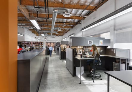
5.11 Tactical is a fast-growing U.S.-based company that creates superior tactical gear, uniforms, clothing and equipment for safety personnel, military and outdoor enthusiasts. When the firm decided to relocate their corporate headquarters to Southern California, they hired LPA to develop a highly creative office environment in an existing office/industrial building. Totaling 20,000 square feet, the new facilities include corporate offices, a showroom space, company store, product display areas, design studio and lab, canteen, fitness facilities and showers. High-impact strategic branding imagery greets visitors in the entry and carries throughout the facilities. Open, exposed wood joists, foil-wrapped insulation and spiral duct work—highlighted by direct and indirect lighting—enhance the corporate image. Multi-functional spaces are defined by movable glass walls and allow for maximum flexibility and functionality for the client’s diverse needs.
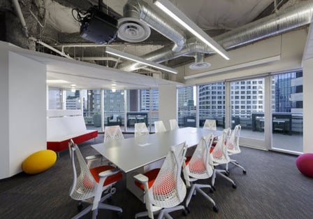
mindtouch is a software company responsible for many of the ‘Help Desk’ interfaces on the web. Their new headquarters is located at 1 Columbia Place in San Diego, a newly repositioned office property reimagined by LPA. mindtouch had been experiencing phenomenal growth; they had outgrown their previous office space which lacked personality, creativity and branding, and they prioritized these elements for their new space. The design incorporated exposed open ceiling areas, direct/indirect lighting, private offices with sliding doors, informal gathering spaces and a socially active break/game room that also serves as an after-hour work space. Red was boldly and generously utilized as an accent color throughout, creating a lively environment and making a bold statement about the company’s culture. mindtouch’s sixth floor offices have an inviting wrap-around outdoor terrace space and access to the building’s expansive seven-story interior atrium.
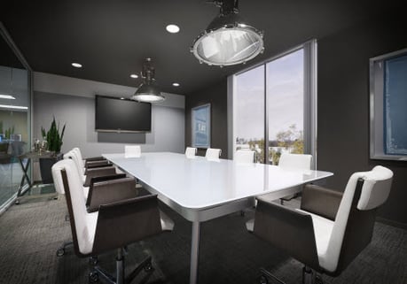
LPA’s design for the 22,000-square-foot offices for Rimrock Capital Management is centered on the concept of the “office home.” This office environment reflects the comfort and convenience of a home and is stimulating, nurturing and pleasantly quirky. The reception area is treated as the entry foyer, telling Rimrock’s story through photos and branding. The open office space is treated as the living room—open, comfortable and inspiring with a breath of fresh air. The office kitchen is the social hub of the space—a fun, off-beat place for gathering around a communal dining table. Conference rooms are set up as “think tanks” where the staff is enveloped by the space, and strategic branding reinforces “time is money.” Quiet rooms are welcoming and provide a space for focused work. Daylight is brought into the space through the use of Solatubes along the building core, with glazed office fronts throughout, reinforcing transparency and open communication.
A version of this article originally appeared in LPA Studies: 1 Columbia Place.
Karen Thomas, CID / LEED AP BD+C, has more than 20 years of experience in all areas of commercial interiors, which include corporate headquarters, tenant improvements, tech companies, firms and financial institutions. She maintains an impressive roster of corporate clients, including AST, Bank of America, Aetna Health Plans, First American Financial, Pacific Life, Union Bank and Western Digital Corporation.


