Healthcare Design: Five Steps to Stand Out in a Competitive Market
 The healthcare industry is facing a pivotal moment in its history. It’s quickly becoming one of the most competitive in the nation, with each provider striving to attract and retain life-long clients with patient-centered facilities that provide cost-effective and efficient services. Combine this with the fact that the Affordable Care Act is challenging the entire industry to do more with less. In such a competitive landscape, providers need to address one of the top complaints by visitors of healthcare facilities: the frustration of getting lost.
Effective branding and wayfinding are critical in helping patients and visitors seemlessly navigate through healthcare facilities. Wayfinding and signage are tied very closely to the brand and ambience experience, and require a keen balance between interior design, environmental graphics, and digital and traditional signage.
 1. Strong brand identity in healthcare facilities—which is critical to attracting and retaining patients—starts with the envisioning and development of a solid branding statement that instills confidence and loyalty in patients, visitors and care providers. Imagery and bold words, like Memorable, Positive, Consistent, Healing, and Quality, are used to define the branding statement with the client.
2. Once defined, the client’s specific branding statement is interpreted into the physical space through the use of environmental graphics, imagery, color, movement, lighting, artwork, ambience and visual cues throughout the facility.
 3. Wayfinding starts as a patient approaches the project site and deeply affects their entire experience at the facility. It’s especially successful when it reinforces clear routes through the use of subtle architectural cues and key patient touch points.
4. Signage and graphics should be simple, clear and straightforward. Based upon a progressive disclosure of information, it should use appropriate text, fonts, color, size, location and directional information.
5. All architectural surfaces and components—floors, ceilings, walls, architectural forms, and positive and negative space—are integrated into the resulting design, working in harmony to express the client’s brand. The resulting design reduces anxiety and minimizes frustration, while ensuring a positive and memorable patient experience.
LPA was recently engaged by a client to interpret their branding guidelines for their new and expanded outpatient healthcare facilities in Southern California. The LPA Healthcare team, with architect-of-record Boulder Associates, developed the branding and environmental graphics for the project, including display graphics, signage, wayfinding, donor wall concepts, lighting, furniture and interior finish selections.
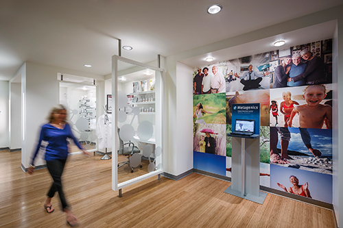
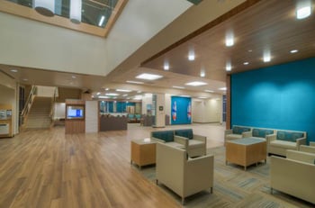
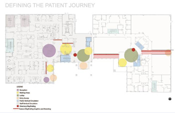
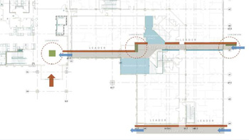
 A wayfinding system known as ‘Leaders and Landmarks’, was created to help transition visitors and patients into and throughout the common areas of the facilities. Display graphics were developed, using content, color and texture, to define key landmarks within the space and showcase the history and culture of the beach town community that this facility serves. Leaders help define the direction through the use of specialty lighting and materials, while transition spaces incorporate pathways and seating niches for visitors. The existing corridor leading from the parking structure to the building lobby was re-imagined, using the client’s branding imagery and the new wayfinding techniques developed by the team for the project.
LPA’s new Healthcare studio brings a fresh approach to facility design—focused on an integration of branding and wayfinding that is essential for this fast-changing industry. We have been creatively interpreting brand image for our clients for nearly 50 years, across corporate, civic, developer and educational facilities. Our healthcare clients tell us that LPA uniquely brings retail sensitivity to the design of wayfinding and branding in their facilities—resulting in a design that sets them apart in a very competitive marketplace.
A version of this story originally appeared in LPA Studies: Healthcare Facilities. Karen Thomas has more than 25 years of experience in all areas of commercial interiors, which include corporate headquarters, tenant improvements, tech companies, firms and financial institutions. She maintains an impressive roster of corporate clients, including AST, Bank of America, Aetna Health Plans, First American Financial, Pacific Life, Union Bank and Western Digital Corporation. Thomas is bringing her branding and interior design expertise to the health care market as a lead principal of LPA Healthcare.
