Immersive Branding for Commercial Interior Design
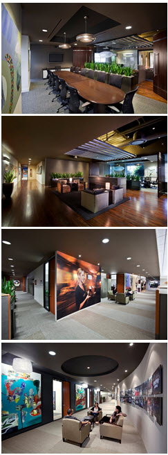
A far cry from a simple sign on the entry, today’s progressive branding schemes have evolved into immersive environments which truly tell a story about their organization. Along with digital signage, graphical elements, creative lighting, furnishings and infographics, designers are carefully detailing, proportioning and styling interiors to make a lasting impression.
 “The success of branding is measured by whether a space is memorable,” relates LPA Senior Designer Rick D’Amato. “Ideally, you want people to take with them a deeper understanding of the company.”
Case in point, for the design of Blizzard Entertainment’s corporate headquarters in Irvine, LPA utilized imagery, materials and deep, rich colors to brand individual floor areas as different video games. To further mimic the video game environment, a darker setting is created by back-lit, glowing translucent panels and uplighting in place of ambient light.
“3D graphic representations of creatures and elements from Blizzard’s video games, combined with creative lighting, decorate the lobby, and convey a sense of being inside a video game,” explains D’Amato.
With corporations competing for the best and brightest, D’Amato goes so far as to suggest that branding is becoming almost vital to a company’s recruitment and retention efforts.
“Employees want to feel like they’re a part of something bigger, so making the environment really speak to what the company does and what the community is about is essential,” he says.
 For the Yard House corporate headquarters in Irvine, LPA designers took the characteristic Yard House theme of piping beer from the kegs to the draft pumps at the restaurant’s bar and applied it to the ceiling treatment in the office’s main lobby. In addition to the pipe-styled ductwork and lighting, reclaimed wood, plants and natural materials also mimic the organic feel of this popular eatery, all way down to Classic Rock playing quietly in the background.
Going way beyond simple signage, the Yard House’s corporate setting is another example of how today’s branding strategies are all about engaging the senses to create an immersive experience.
In another case, color-changing lighting and lenticular imagery were strategically designed for Hoag Hospital’s staff areas where employees enter and exit to create a certain feeling, based upon the time of day. Light blue and green colors energize the space in the morning as the majority of doctors, nurses and support staff begin their work day in Newport Beach. Meanwhile, darker, auburn colors create a relaxing mood as employees head home. In addition, the space is themed with historical infographics and signage describing upcoming events to help create a sense of community whenever folks pass through the space.
“Ideally, a company’s branding should reflect how they do business and what makes them special in the marketplace,” says D’Amato.
Naturally, this message will evolve over time, which was the case with LPA itself. In the old days, the firm’s offices would only display project photos, whereas today, the company’s corporate values, mission statement and project processes are prominently presented within the office environment to communicate what LPA is all about, and highlight what distinguishes the company from other design firms.
Rick D’Amato is a Senior Designer and Principal at California-based LPA Inc. For more than 20 years he has designed award winning spaces for corporate office facilities, retail projects, schools, city halls, libraries and community centers. He is an active member of the American Institute of Architects and maintains an impressive roster of clients, which include Ford Motor Company, Toyota, The Yard House Restaurants, Urban Decay Cosmetics, ASICS America, Blizzard Entertainment, Pacific Dental Services, Mossimo, The La Jolla Group and Volcom, to name a few.