Design Secrets Behind Campus Recreation Centers
There’s a special ingredient to Campus Recreation Centers that can completely alter the outcome. It’s not the most up-to-date Building Information Modeling tools, the largest amount of money to spend, or the highest paid consultants. The magic is in the students. In a recent Student Recreation Center (SRC) designed for Cal State Northridge, we worked with a group of students who treated the project like a “cause.”  Although many of them were set to graduate before the facility’s completion, they were driven to help create a place that was set apart and a legacy for future Northridge Matadors.
The students came prepared. They knew their student body was unique, and that their needs were different from other Cal State campuses. This is where we started coming up with unconventional solutions. To their credit, they didn’t flatly reject ideas just because they’d never seen them built. There was trust that isn’t always present with people who’ve done a lot of these kinds of buildings.
They took time to think about and express their priorities, one of which was always sustainability. If we proposed a design feature that’d increase the eco-friendliness and efficiency of the SRC, they were all for it. In this post, I’ll review a few of the outcomes that came about as a result of inspiration from the students, the faculty, the program, the site, and the unique challenges of the project.
SKY HIGH AMBITIONS
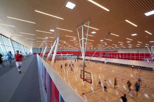
The student-funded rec center at Cal State Northridge has a very unique ceiling plane. It’s kind of a subtle thing but it’s one of the distinct interior features. Typically, with gymnasium spaces, ceilings are raw and a lot of structure, ductwork, and big, hanging industrial light fixtures are seen. The Northridge SRC is a more modern, student rec center. It’s not only about the gym, but it’s a place to relax and hang out with friends. The special, more finished ceiling does several things: it integrates the skylights and provides a return air path for the displacement ventilation system. Fundamental design choices made together by the structural and mechanical engineering, architecture and planning designers made this possible. This exemplifies integrated design – it’s all hands on deck from the beginning, committed, working toward a common goal.
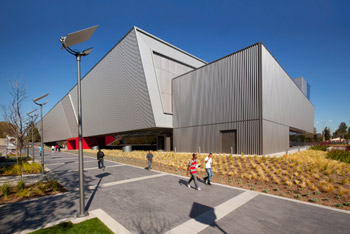
Although the west façade is solid, it’s the same material (perforated), as the other student buildings on campus. It’s the pot of gold at the end of Magnolia Walk. We call it “campus building,” when the building you add doesn’t just serve its purpose, it makes the entire campus better, and more cohesive. The SRC at Cal State Northridge is the grand finale of the heavily trafficked, magnolia-lined walk. It also helps site the building and incorporates the school’s colors.
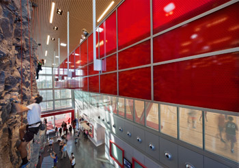
People didn’t realize that the top floor captures a panoramic view of the context. When you’re on the first floor, you forget that the campus is surrounded by this amazing valley. They had no idea that the campus is encircled by such beauty – it’s a larger-scale gesture, zooming out, where architecture adds to the perception and experience of “place.”
We wanted to create interior views too; there’s an interior landscape inside of this rec center. The building, if you remember from Living Rec Centers Part 2, is 600 feet long. It’s different as you circulate vertically through it – the ground floor has all of the small spaces (fitness rooms, locker rooms, studios), and as you move upward, the scale gets bigger and bigger. How students interact with each other, changes, as well. It’s interesting. It’s typically the reverse (gym on bottom, small spaces on top).
STRIKING ARCHITECTURE
The contrast between the two, long elevations is architecturally dramatic. It makes sense for this building and it works – although it is unusual to have such difference in opacity between different elevations on a building. Again, instead of raw and unfinished, it’s a more elegant solution – unexpected and appreciated by the people who occupy it.
Glenn Carels is a Design Principal at California-based LPA Inc. As the California State University system moves toward greener campuses, Carels has played a critical role in the implementation of their sustainability guidelines and initiatives. During his 28-year career, he’s garnered 44 AIA awards for his design work in Higher Education facilities.

