Architecture and Design Highlights 2013
 A tradition that has been with us since 2009, we look at some standout moments in architecture and design. On this final day of 2013, we look back on a year full of new endeavors, big challenges and collective successes. And this year, our top five moments of 2013 are identified by you, dear reader.
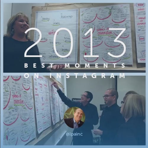
If you have a Facebook, Twitter or Instagram account, you’ve likely seen at least a few year-in-review posts—a compilation of one’s favorite photos posted throughout the year. We simply could not resist the opportunity to reflect on the happenings of this year, and we posted LPA’s Best Moments on Instagram. These were the top five highlights in architecture and design for 2013. Thank you for spending another year with us, and we’ll see you in 2014.
-4954.jpg) 5. Comprehensive Corporate Branding at Pacific Dental Services in Irvine, Calif.
5. Comprehensive Corporate Branding at Pacific Dental Services in Irvine, Calif.
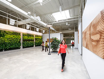
According to Senior Designer Rick D’Amato, the newly envisioned headquarters for Pacific Dental Services (PDS) reflects a fresh direction for the way in which the company works and collaborates. The concept is focused around an “urban village” approach which incorporates internal boulevards, parks and neighborhoods providing daylight, landscape elements and organization to over 82,000 square feet of contiguous single level space. One of the most impressive features of the office is its wealth of natural daylighting. Skylights and Solatubes flood the almost windowless, while internalized vertical vegetative walls bring exterior landscape indoors and provide an organic connection to the environment.
4. 21st Century Learning Environments at San Marcos High School in San Marcos, Calif.
San Marcos High School is a comprehensive high school organized by discipline into Professional Learning Communities. LPA's K-12 schools design team took inspiration from these communities to create four main buildings on the campus. These include a three- and four-story building that contains a majority of the classroom space, studio-style classrooms and laboratory spaces, athletic spaces that include a 3-court gym and dance/aerobic studios and a 400-seat Performing Arts Center with teaching spaces for visual arts, band and choral lessons and performances.
The transformed school, which debuts in 2014, will meet the healthy school standards of the Collaborative for High Performance Schools (CHPS) and the campus will promote student achievement with a healthier environment and save on operating costs by including energy and water saving strategies and storm water efficiencies that will contain or scrub and water that may leave the school site.
-_u0a1922_bonus.jpg) 3. Sustainable Parking Structure at Edwards Lifesciences in Irvine, Calif.
3. Sustainable Parking Structure at Edwards Lifesciences in Irvine, Calif.
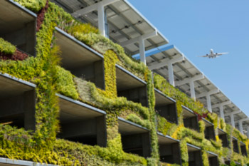
While a parking structure is certainly a unique example for a sustainable integrated approach, it demonstrates how integration can benefit a range of projects. A very impressive component to the four-story, 1,200-car parking structure is a 4,000-square-foot living wall placed between the structure circulation towers. This large living wall becomes a green backdrop to the campus’ open space, but its breathtaking design is not just for aesthetics. According to LPA President Dan Heinfeld, the living wall serves functional purposes, including screening the cars and giving the users a hint of the future landscape development.
2. Rehabilitating Neutra’s Arboretum at the Future Christ Cathedral in Garden Grove, Calif.
LPA has been working with the Diocese of Orange, to bring the Arboretum into the 21st century without disturbing the architectural significance of its rich history. The Diocese acquired the Arboretum in February 2012. Originally designed to be cutting-edge in 1961, the 22,000-square-foot building needed aesthetic and technological updates. Richard Neutra, one of Southern California’s most celebrated architects was hired by Rev. Robert Schuller for the project.
“We realized that this project wasn’t preservation, where you’re trying to lock it in time. It’s not a restoration, where you rebuild what was originally there. It’s a rehabilitation to make the building new,” says LPA Principal Jim Wirick. “Aesthetically, we want to look back. Technologically, we need to look forward.”
LPA’s design approach involves renovating the space in a way that allows Neutra’s original design intent to be brought back to life—including his own palette of colors that were hand-mixed onsite—while also retrofitting the building with modern technology.
 1. Interactive Education at ExplorOcean Museum in Newport Beach, Calif.
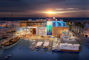
The ExplorOcean Museum will be a one-of-a-kind experience for amateur oceanographers and has the potential to become a primary destination for all those living in and visiting the Southern California area.
The facility’s foundation is in sustainability and is designed to a LEED Platinum rating. Its sustainable message will be evident to patrons with highly efficient elements like a 12,000-foot PV array, which will provide approximately 15% of the energy use. And because the project was designed with an integrated approach, 25% of materials used in construction have been locally sourced and 20% of all construction material is made up of recycled content.
“This is being designed as a family friendly destination which will attract a world class audience and provide the most sophisticated in technology with regard to education as well as entertainment,” explains Senior Designer Rick D’Amato.
